Tuesday, September 11, 2012

20 ways to use a flag in your home


This post is taken directly from here, especially for September 11.

2012 is a perfect year for the flag theme. EURO has barely ended but we are already preparing for the Olympics Games in London. The great thing about flags is that they do not only appear at the sports facilities or they are not only an essential part of fan accessories, but flags are more often use as a pattern on our clothes, plates, or even nails.

Why? The answer is quite simple: Thanks to flags, with a simple gesture, we express sympathy for the country. Additionally, flags compose an attractive decorative element. No wonder why during last few seasons flags have been endorsing by so many fashion designers or even recently by the interior decorators.

Of course, with no doubts the two most wanted are the British and American flags, but it does not mean that Brazil’s or Spain’s flag might not become popular any time soon. Basically, if you are proud of your own country or want to emphasise that the country is close to you, do not hesitate, just hang the flag on your room walls!

While decorating your home, keep in mind that flags look good in both: modern and traditional interiors. Moreover, flags focus that much attention that sometimes even a small item such as pillow can dominate the whole decor.

We are really into this flag trend, that is why we want to show you 20 interior designs with a flag as the leading or secondary role, which has certainly made a huge impression on us. Be inspired!

Source: InteriorDesignPro

Source: Home Stories A2Z

Source: Méchant Design

Source: Jamie Hempsall

Source: Swifts Orchids

Source: Pottery Barn

Interior designs inspired by the british flag


Source: Photographer's selection

Source: Design Sponge

Source: Nordic Rooms

Source: Home and Decor

Source: Home and Decor

Source: Apartment Therapy

Source: The French Mouse House

Source: Rona Mag

Source: Nordic Rooms

Source: Best Home Design

Source: The Woodbridge Carpet

American-british flag variations


Source: Irene Turner

Source: Color Outside the Lines

Source: My Sweet Savannah

Monday, September 10, 2012

concrete floors


A trend which is appearing more everyday in interior design is concrete flooring. It is now being used in both commercial and residential environments. Using concrete as a finished product is both cost effective and durable. Wooden floor is very expensive and tiles, (not if) but when they crack are painful to replace.

There is a product called aggregate which is used in concrete flooring. Aggregate are small rocks which help bind the concrete together. You can either have revealed aggregate or hidden. I prefer the revealed look, I think it gives the flooring more personality. Another option to consider is polished concrete, this leaves the floors a little shiny, a great option for residential spaces.

concrete floor, cement flooring, polished concrete interior

With its neutral color, it will pair up well with many hues. Add some wood elements to warm up the space a bit.

concrete floor, cement flooring, polished concrete interior


When you think of concrete floors, your mind goes directly to industrial design. But you may take it in another direction. Using traditional and feminine decor and furniture will transcend the industrial and make it glamorous.

concrete floor, cement flooring, polished concrete interior


Lots of white and punches of colours looks great with these floors too.

concrete floor, cement flooring, polished concrete interior

Or take its macho character and go with it. Some industrial finishes and sleek vintage wood furniture would be great for a bachelor's pad.

concrete floor, cement flooring, polished concrete interior


Another thing that I like about it is I think it's so low maintenance. It's used in home depots and garages for a reason right?

concrete floor, cement flooring, polished concrete interior

Concrete + black + wood + tons of white = lovely

concrete floor, cement flooring, polished concrete interior

And for those who love it that much, take it up the wall.

concrete floor, cement flooring, polished concrete interior

So, love it or hate it?

Images from http://www.switcheroom.com/2012/07/love-it-or-hate-it-concrete-floors.html

neon + home

http://www.creamylife.com/interior-design/9178/neon-bright-home-tour.html
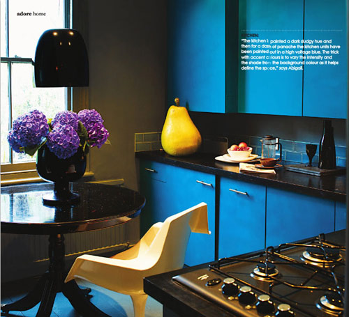
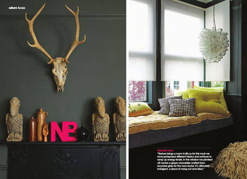
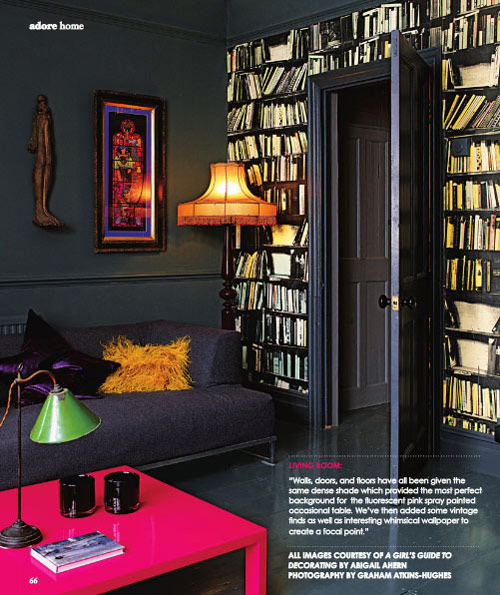
I was flipping through the special edition of Adore magazine the other day and spotted a home tour which is definitely not for everyone! Decorated mostly with dark hues, the home does have pops of bright neon colors seen in coffee tables, decorative letters, wall art and more. And I remembered that I got to see some pictures of the home before yet never knew they belong to one space (and couldn’t even imagine this!). Here are a few pictures:


Would you mind a hot fuchsia coffee table like the one from above? I don’t think so :). Would you be able to live in such a bright home?
*images via Adore magazine & post by CreamyLife

Tuesday, September 4, 2012

The Finders Keepers

This morning The Finders Keepers announced the artists and designers for the upcoming Melbourne October Markets stallholders line-up, here is the first half, A-K! Cannot wait to see the second half! Is anyone going or presenting?

Once again we are showcasing lots of new designers from all around Australia – The countdown is now on! Make sure you mark this one in your calender as the Spring/Summer market event is not to be missed! As there are over 130 stallholders to display we have broken this blog post into A-K & L-Z, new profiles will be on a website very soon!
Make sure you mark the Melbourne event in your calender as the summer event is not to be missed! and you can also help spread the word via our Facebook event invite.


Here are a few to excite you!


Beneath the Sun


Bespoke Letterpress


BLANK


Bonsai Kitten


bRainbow


Bride & Wolfe


Crayon Chick


Elkhorn


Emily Green


Emma Leonard

Inky Co.


Kim Wallace

http://www.thefinderskeepers.com/blog/2012/09/melbourne-ss12-designers-announced-a-k/

A few little treats!

Here are a few little things I have stumbled across recently that I thought you design lovers might enjoy!


WANT to add some HAMPTON'S STYLE to YOUR HOME? Enter our competition & you could win $440 worth of fabric {as shown on comp page} - to begin your room update.


Enter everyday for more chances to WIN - SHARE comp on YOUR page for EVEN MORE chances.


Who wants to get their creative on???
Unleashing Your Creative Flow
Saturday 29th September . 4pm
with LISA MADIGAN at the store
$79 BOOK NOW!!! xx


Spring has finally sprung! Each week this month we will be sharing a seasonal design tip from the Editors of Australia’s leading home and lifestyle magazines.

Our first tip, from Real Living Editor, Deborah Bibby is for the Living Room: ‘Pack away any furry cushions or throws. Swap out all those dark colours in the living room for bright, breezy fresh colours. Roll up the rug and replace with a cotton rug or sisal (the soft under foot one)’.


Miss Reupholstery

Recently I have tried my hand at a little reupholstery.


The original 'Adam's Family' chairs.


The fabric I chose (very, very quickly!)


Where I am up to at the moment...


Almost there! I am just looking for some lovely piping to hide the messy edges!

Monday, September 3, 2012

Blue is the new black?


Do you remember the post from a few weeks ago on the navy trend? Well it seems the design duo Arent & Pyke are enjoying it too! If you missed it, here it is!


Arent & Pyke are really into inky-blue and shades of navy. We’ve showcased this colour extensively in this house in Sydney’s Balmain, which we are proud to say was shortlisted for the 2012 IDEA Awards for Residential Decoration.

There is an inherent ‘freshness’ to the colour navy, so we use it to add depth and richness to an interior, without the heaviness and finality that black or other deeper colours can bring. Natural materials such as timber, leather, marble and linen are complemented by navy in all of its tones.

In the Balmain house navy is accentuated by the neutral tones of taupe, white, beige and tan. It’s used to provide a subtle block of colour that draws together the tones of the owners’ significant Australian art collection, and ties it with the sea and the sky that lie just beyond the windows. It also grounds a mix of new and vintage design – mid-century furniture, ceramics, rugs and textiles curated to complement one another and create a mood that is evoked by the art. Blue, my friends, is back!’

"Blue really is the new black!" -  Check out Arent & Pyke’s favourite products from hardtofind. on this week’s Pinterest board.


http://blog.hardtofind.com.au/2012/08/in-the-navy-by-guest-bloggers-arent-pyke/

These ladies are working hard and doing it all for a good cause. You can find out more information on their facebook page, the link is below. Well done, I am so glad I stumbled across this fantastic event!


Please come along to our Stylist event to raise funds for the Breast Cancer Cushion Project.


https://www.facebook.com/events/245086092277940/