Showing posts with label blue. Show all posts

Monday, September 3, 2012

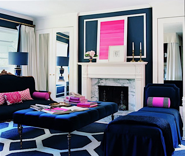
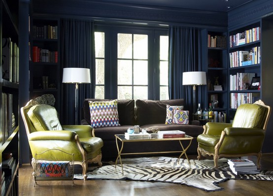
Blue is the new black?


Do you remember the post from a few weeks ago on the navy trend? Well it seems the design duo Arent & Pyke are enjoying it too! If you missed it, here it is!


Arent & Pyke are really into inky-blue and shades of navy. We’ve showcased this colour extensively in this house in Sydney’s Balmain, which we are proud to say was shortlisted for the 2012 IDEA Awards for Residential Decoration.

There is an inherent ‘freshness’ to the colour navy, so we use it to add depth and richness to an interior, without the heaviness and finality that black or other deeper colours can bring. Natural materials such as timber, leather, marble and linen are complemented by navy in all of its tones.

In the Balmain house navy is accentuated by the neutral tones of taupe, white, beige and tan. It’s used to provide a subtle block of colour that draws together the tones of the owners’ significant Australian art collection, and ties it with the sea and the sky that lie just beyond the windows. It also grounds a mix of new and vintage design – mid-century furniture, ceramics, rugs and textiles curated to complement one another and create a mood that is evoked by the art. Blue, my friends, is back!’

"Blue really is the new black!" -  Check out Arent & Pyke’s favourite products from hardtofind. on this week’s Pinterest board.


http://blog.hardtofind.com.au/2012/08/in-the-navy-by-guest-bloggers-arent-pyke/

These ladies are working hard and doing it all for a good cause. You can find out more information on their facebook page, the link is below. Well done, I am so glad I stumbled across this fantastic event!


Please come along to our Stylist event to raise funds for the Breast Cancer Cushion Project.


https://www.facebook.com/events/245086092277940/

Tuesday, August 14, 2012

Colour + Architecture

Yesterday was a day of firsts for many reasons. I found out how many people are reading my blog on a daily basis... WOW! Thank you!

This post suggestion was inspired by Ruby who is an architecture student, who left a really meaningful comment for me yesterday. These little comments really make a huge difference, so thank you!

I have now created a Facebook page to make navigating the blog and keeping up to date with posts a lot more user friendly. Please go to the Facebook page and like it so we can keep in touch!


Architecture can move us, it elicits different emotions, it can bring back memories and elicit direct emotions, like letting you feel small or big, or providing a safe feeling or even an unsafe one. When creating a space, whether it be in regards to styling, decorating, building, or designing we all try to elicit enjoyable emotions. Architectural spaces have certain atmospheres that influence the emotional state of a person: the interaction between the environment and its occupant.

Colour is a very powerful mean in architecture. How we experience colour depends on the colours surrounding us in our daily life. Warm and cold colours play an important role in our lives and evoke very different moods and emotions. We experience them in the variations of daylight from morning to evening and even into the darkness of night. 

The eye adjusts itself to the gradual change so that the local colours of details appear the same throughout the day. But if we observe something as a whole, a street scene or a lounge room for example, we become aware of the changes in the colour scheme. The mood of the scene and often even our mood changes with the changing light.

Here is an image I took this morning. Initially I was frustrated that the light was battling through the trees and casting shadows onto the Victorian Cottage and then I thought a little more about it and realised just what an effect it was making. 


I thought it would be interesting to focus on navy or dark blue. It is a colour I never really enjoyed until now, I think this has a lot to do with the relationship I draw between it and my school uniform. But now that that is long gone... Let's enjoy navy blue.


All images from google or self taken.
http://experiencingarchitecture.com/2011/05/19/colour/ 

Tuesday, August 7, 2012

Colour combinations for your special day!

Wondering how to pick your wedding day colours and make them work? Here’s a guide to creating a winning palette.
by The Knot 
 
10 Fabulous Colour Combos- Yellow & Duck Egg BlueThe hottest thing happening at wedding receptions isn’t just on the dance floor — it’s on the wedding cake, the invitations, the centrepieces, and even the bride’s gown. It’s big, bold colour. Years ago brides used colour to accent their white wedding day decor, but now they’re using colour to cover every inch of the wedding. We’ve developed a step-by-step guide on colour coordination (from choosing it to decorating with it) to help you dream up a bright wedding day.

Choosing Your Colour

First things first: location. When deciding on a scheme, you must consider the reception space or choose a space without decor or colour. If you’ve chosen a country club with navy and maroon Oriental carpets, a colour scheme of lime green and hot pink won’t work.
Next, become aware of colour combinations that you like, whether browsing art galleries or flipping through a stack of fashion magazines. You might be able to narrow down your colour choices to a half a dozen. To help you choose the exact hue for your wedding details, visit a local fabric store or paint shop and collect swatches or chips of colours you might want to use. This will help you get specific, so that when you decide on green you’ll know if it’s lime green, kelly green, sage green, or forest green. If you have access to a Pantone book, use this collection of colours to select your shade the same way graphic designers do. Many invitation designers mix ink to match the colours in this book, and many cake bakers use Pantone numbers as a reference when creating dye for frosting. Can’t decide on just one or two colours... choose three!

See below for some great colour combinations!


10 Fabulous Colour Combos- Fuschia & Navy

10 Fabulous Colour Combos- Green & Brown

10 Fabulous Colour Combos- Pink & Aqua

http://theknot.ninemsn.com.au/wedding-planning/wedding-colours/picking-your-wedding-colours

How about a little yellow...

Stylish Yellow Wedding Details- Yellow Table Number Stylish Yellow Wedding Details- Bird Themed Table Setting Stylish Yellow Wedding Details- Chair Pom Poms Stylish Yellow Wedding Details- Mr. & Mrs. Table Sign Stylish Yellow Wedding Details- Menu Card With Twine Stylish Yellow Wedding Details- Initial Wreath  Stylish Yellow Wedding Details- Mis-Matched Centrepieces Stylish Yellow Wedding Details- Candle Votives 
http://theknot.ninemsn.com.au/wedding-planning/wedding-colours/yellow/stylish-yellow-wedding-details?photo_index=10