Wednesday, June 6, 2012

Copper Lighting

Design Sponge is a design blog run by Brooklyn-based writer- Grace Bonney. The site updates 6-8 times a day and attracts a diverse group of readers all around the world.
Since I am attracted to all things design, and in turn consider myself a 'design sponge', I love hunting through Bonney's blog for all sorts of ideas. See here website here.

This morning I found a DIY for making a coffee table with copper legs on Design Sponge. Although a strange thought, this DIY means more to me than it probably should! I'll tell you why...


My final work for university was a series of lights. The main materials used in my lights were wood, sandstone and COPPER! I loved working with copper, although I might have given you a different response at the time. I find such value in a material which is intended to be hidden. Copper is what is used for a lot of electrical, roofing and plumbing work in the construction industry. But I found a different purpose for it.

I found interest in using an industrial material for a function and aesthetic purpose.

Here are some images of my designs...

I believe these to be good stating points, a nice introduction into the design of lighting. Scroll down to the bottom to see the direction in which my thoughts and designs are heading.


This final light is my least favourite, however it was the starting point for my designs and therefore I owe it something! One thing I did learn is that it is hard to be a perfectionist when using copper. Copper reacts to heat, so everyone it comes in contact with fingers the marks stay forever. Unless, you are half mad like myself and take to it madly with copper cleaner and a cloth for hours on end. Don't worry, the final product is always worth it!

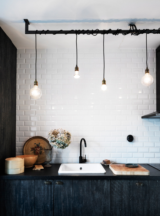
I am starting to further my lighting designs.


http://img3-ec.etsystatic.com/il_570xN.310584087.jpg


http://poetichome.com/wp-content/uploads/2008/10/vintage-industrial-lighting.jpg


http://hudsongoodsblog.com/wp-content/uploads/2010/04/industrial-trouble-light-1.jpg


http://s3.amazonaws.com/static.fab.com/inspiration/82945-612x612-1.png


http://www.rustyhingesblog.com/wp-content/uploads/2012/05/cagelight1.jpg


http://origin.kaboodle.com/hi/img/b/0/0/1c2/c/AAAAC66xwbUAAAAAAcLChQ.jpg?v=1328465221000

https://blogger.googleusercontent.com/img/b/R29vZ2xl/AVvXsEgsEX6roXXtZ6rbHEmeQcmGrWjHz910eYaUWbvtk9DLWdFqUMDupxZ-PBmyXGY2KRHMwGj4_6dAgkAzsCqnvwVzggnzRwZTHnqnE_4fyelqEvQ9XX2fJNktnsrCpPLXUjgKqQxdyHU_QNzy/s1600/04182110.jpg

Monday, June 4, 2012

Jane Cameron: Fete Magazine


Jane Cameron worked as a corporate graphic designer before starting her own stationery business, but these days she’s working on her dream project as co-founder of fête magazine. After teaming up with event planner and stylist Annabelle Kerslake, the two created a new online magazine devoted to parties and entertaining for people like them (without huge budgets). Jane is based in CBD, Adelaide, South Australia, where she and her husband, John, share their 1873 two-bedroom sandstone cottage. One of the earliest in their city, their home was recently heritage listed. Jane, who has always thought that she should have lived in the Victorian era, felt like she was moving home with this house. It’s the perfect setting for her to troll junk and antique shops as well as Etsy and eBay, mixing in modern accents along the way (her husband, of course, would prefer a colourful, contemporary modernist home, but Jane wins out on this one). And don’t miss the latest edition of fête (which means “party” in French).

The rest of the article can be found here. It's a wonderful read!
 
Image above: This is one view of my office. The table, made from reclaimed Oregon, is actually about 8 ft. long and fits a number of computers along it, which comes in very handy as Annabelle comes to town a couple days a week so we can work on the magazine together. The Venus chair is from Freedom, the FORSÅ work lamp is from Ikea, the artwork hanging on the wall is a Black Robin Tea Towel by Bonnie & Neil, and the black resin Small Earth Bowl is from Dinosaur Designs. I painted some Ikea wooden storage boxes white, then applied Dymo labels – I am thoroughly addicted to that little machine. Part of my string collection sits on top of the boxes. One of my Victorian brown & white transferware tureens, bought at auction, sits on a David Bromley pedestal that I painted black.


Image above: This photograph is an antique shop find — I collect old photos and ephemera that have something to do with Adelaide. I’m a bit of a closet historian and love my city, so I see it as a way of honouring my home town. As I like to change things around a lot, I often stick them to the top of the glass with brown tape; that way I can change my mind as often as I like with minimum effort. The patterned print in the background is an Etsy purchase by Ashley Goldberg. The little Victorian pots are part of yet another collection, all purchased from eBay in the UK.


 I have just spent the first few minutes this morning searching through the fetepress.com.au website. It is very clean, yet warm and inviting and I love their moto;
"We believe in making time for family and friends, making it just a little bit special and celebrating."


Sunday, June 3, 2012

[ff] Framed Fabric

As a textile enthusiast I couldn't go past this idea!

Wouldn't it be great to take all the prints one has designed and decorate your own walls with them?
I believe textile prints to be works of art themselves, and art belongs on walls, so why not add the two together to create something really special.


Photo from Made by Girl.

People are always looking for the perfect furniture to match the colour of their walls, or the perfect vase to compliment their cushions. So why not solve one problem, that is; matching your artwork to the decor of your living space, by creating it yourself. 


Here are a few more I found...


I love the eclectic mix in this space! The framed fabric sets the mood and scheme for the space, yet in contrast to its tribal feel, the sofa is (relaxed) french inspired in style and the armchair has a (strong) baroque style pattern. The rug and stool are a modern take on more traditional tribal pieces, and the use of plain cushions helps keep the space looking modern and fresh.

I stumbled across Rochelle's blog this morning "Little Nudge" and she had this to say about setting the tribal decor.

'To keep your space modern, make sure you mix in shades of white and or blocks of colour (light or dark) to break up all the patterns, add a glass coffee table in contrast to all the darker heavy items, and don’t be scared to throw in a colour that is not necessarily ‘tribal’ like the yellow ottoman above or the blue daybed."


Taken from: http://littlenudge.wordpress.com/tag/fabric/


Photo from: http://www.besthomy.info/2011/12/best-modern-concept-of-fabric-wall-panel-art-from-marimekko-hgtv/fabric-wall-panel-art-green-frame/


Design Trend: ikat


Ikat is the method of weaving that uses a resist dyeing process similar to tie-dye.  The dye is applied prior to the threads being woven to create the final fabric pattern or design. Ikat is a near universal weaving style common to many world coltures and is one of the oldest forms of textie decoration. I find the colours and patterns involved in the ikat design vibrant, intriging to stare at and rather chaotic at times. The use of this fabric has been a big design trend for a while, however I cannot help thinking they are making a comeback in a big way- if not just for the technological suggestion of the name ikat, like ipad, iphone, etc. Check out these examples:
 Ikat textile design for the home


 Ikat cushion textile design 

Ikat cushion textile design


  Ikat cushion textile design 


 Ikat textile design for the bedroom


  Ikat fashion textile design for Balenciaga


All images credited;
https://blogger.googleusercontent.com/img/b/R29vZ2xl/AVvXsEgOtIrdL_cdWyKDqwuQoMDp4kqHWIaKolrbp31vNXZeG_HXVfiYJfAhPdt8nFNcPI9o9JycFBuwLoxM7pZEPEKgADzAhhkusRfLOuP6gU_lpRVlCak1PrdH0PEuC8Q53XigcQmlYlyX9GQ8/s1600/ikatpillow_pillows.jpg
http://si.wsj.net/public/resources/images/EW-AJ969A_ikat_G_20110120145302.jpg


Saturday, June 2, 2012

Simplicity

White is simplicity.


Kardboard?


Kardboard, yes Kardboard, in a whole new light!


In Europe, KARTON means Cardboard. In Australia, KARTON means forgetting everything you think you know about cardboard. 
KARTON is what you get when you leave a stack of cardboard sheets alone in a room with some of Europe’s brightest engineers.
KARTON is affordable, durable and beautiful. It's also 100% recyclable.
Move it, flatten it, store it or leave it exactly where it is.

Discover the flexibility and convenience of a dining table you can carry across the room, a bed you can flatten when your guests head home and a kid's table that relishes a lick of paint!
KARTON is about keeping things simple and easy - proof that quality European design can also be cheap and accessible. It's available exclusively online, so there's no middle-man. 

JOIN THE FOLD and see for yourself. 


http://kartongroup.com.au/

Moroccan Textiles


oh morocco... one day!
I am one for simple textile prints, however I couldn't resist the temptation of creating something gracefully chaotic. Although I don't share any of my textile prints just yet, this one is particularly special and exciting to look at.
Have a look at some moroccan decor and inspiration.


http://lonnymag.com/issues/35-may-2012/pages/1#p101