Showing posts with label living. Show all posts

Sunday, January 13, 2013

Yellow, grey & a little textile

Loving the colour & textile print combination! I'd love to do a project with this much print, & you know I can't go past grey either!  

What do you think?


Elle x

Image via houzz

Monday, October 15, 2012

summer living


It's almost here (somedays) & gone the next... but, summer is coming!


I love the soft colour palette and subtle patterns of this Summer house in Sweden. It is so warm and welcoming and the contrast of the last home we posted in style and theme.


Saturday, October 13, 2012

Indoor + Outdoor Living


This weekend we joined in the SunSuper Ride to Conquer Cancer. Here is a little information on the event. 

The Sunsuper Ride to Conquer Cancer announced ­1,623 Riders raised over $5.7 million for The Chris O’Brien Lifehouse at RPA as the first annual Ride commenced Saturday morning at Sydney Olympic Park. Ride participants will cycle over 200 km through New South Wales with an overnight camp in Camden before returning to Sydney for an emotional finish on Sunday. 

Funds raised by The Ride are put to use immediately, and this week construction reached a notable milestone with completion of the building’s top floor and installation of the central lifts. Due to open in July of next year, The Lifehouse was envisioned by late Professor, cancer specialist, and surgeon, Chris O’Brien to be a fully comprehensive cancer centre for all Australians. 

Being surrounded by nature was really lovely and therefore the inspiration of this post on combining indoor + outdoor living.

This home was designed by the owner and architect Arthur Casa (his surname means house in Italian, my Italian might be rusty but I picked up that one!) and is set amongst a rainforest. 


image via Richard Powers

I really value the indoor outdoor living, double height ceilings and the natural backdrop of the rainforest. It establishes a sense of freedom and creates a direct relationship with nature.


image via Richard Powers
The interior incorporates ethnic patterns and natural fabrics, while the rich earthy tones add warmth and texture to the living areas. 


"An indoor outdoor dining area has been integrated with the cooking area to one end of the kitchen island design whilst a feature pendant light, designed by Camilla Diedrich for Rotaliana, hangs over the other end."


This house creates a balanced environment between the surrounding natural habitat, clean architectural lines and an ethnic modern vibe.


Feel free to leave a comment or share what your dream home looks like, below or over at the Facebook page.

Here are some of our images from the weekend!


Friday, October 5, 2012

Cushions for Mumma W

A friend, let's call her Mumma W, is having another bub (yippe!) and is moving into a new apartment. She is looking to add some colour into their living room by purchasing new cushions. The family will have 2 young children so light colours are definitely out of the question.

What we have to work with:
1. Let's keep the budget low
2. Charcoal couch
3. Young children, no light colours & its longevity is important too
4. Bold colours that will work with the remainder of the space

So here are my suggestions on where to find the cushions you want;

ferm Living:
is an Australian company with a love of Danish design. They sell wallpapers, wall stickers, cushions, kitchen items and all sorts of lovely homewares. They even have a clearance section at the moment.


KAS:
their philosophy is to create fashion led lifestyle ranges for the home. KAS distinguishes their products from other homewares suppliers through their co-ordination of designs and colours across all their different products.


The Brown Trading Co.:
's focus is to create gorgeous, sophisticated home collections. It is run by a brother sister team, who's exuberant and stylish approach to life is evident in every aspect of their business. Their motto, 'it must be fun' is at the core of everything they do. How fun is that!?


If I had a brand new charcoal couch to dress I would probably choose a zig zag black and white cushion, something with lots of colour and then a couple of other cushions with a 'focus colour' to tie them together.

Yellow and grey are a great combination, like this throw:


crafty blossom

Here are my picks;


Delphine Ottoman (pink)
All cushions are designed to complement textures and colours in the KAS range.

Aviary Bird (multi)
Embroidery on printed cotton duck


Casablanca (berry)
Rayon satin stitch embroidery on faux linen


From Etsy store: Skinny laMinx
http://www.etsy.com/listing/84199372/cushion-cover-50x50cm-flower-field-in


The Brown Trading Co.


Knitted Floor Cushion Charcoal
I cannot go past this floor cushion!


Tips:

1. Think not only about the space as a whole, but also about the apartment/house. Purchases will become less of a craze when they can be moved throughout the house from room to room. i.e. Mumma W might end up using the cushions in to bring colour in the bedroom or in the nursery. (pink or blue....?)


2. Using bigger cushions on a couch tend to have a more expensive look.

You can also make a space more interesting by using cushions of different sizes and dimensions, there is no need to stay with the norm.


Any other hot cushion tips or decorating ideas for myself or Mumma W?


Wednesday, August 15, 2012

ferm Living

Don't forget to go to the facebook page and 'like' the page for regular updates!
https://www.facebook.com/designformfunction

ferm LIVING is a Danish company that aims at designing and manufacturing interior products with a graphic touch. The product range consists of wallpaper, wall stickers, textiles, kitchen items, a large KIDS collection and much more great stuff to come…


"ferm LIVING originates from a graphic design agency in Aarhus, Denmark, founded by Trine Andersen in 2005. The company came to life after Trine, mostly for fun, decided to visit a clairvoyant. (Who would have thought!) Trine was quite astonished when the clairvoyand saw a little bird sitting confused on a branch, not knowing which way to fly. This sight was essential for Trine’s decision to follow her dream of starting her own business. When she then founded ferm, the little bird found knew exactly where to go and now sits on top of the company logo.

The company went from being a graphic design agency to a company designs and selling lifestyle products when Trine was re-decoration her house. She was looking for graphic wallpaper, but just couldn’t find the right pattern – and when she found it, it was way too expensive. Trine decided, that other people probably felt the same way, so she decided to take it upon herself to create graphic wallpaper patterns at an affordable price. By February 2006, the very first wallpaper collection hit the streets, and since then things have been going fast! ferm LIVING now operates in many markets around the world and has agents/distributors in Australia, USA, Finland, The Netherlands, UK, Spain, France, Italy, Sweden and Japan."


What a wonderful tale, special things can happen when you simply stop and listen...

ferm LIVING are always thinking of new ideas, designs and are always on the hunt for new sources of inspiration. Their blog is a great way of understanding how their design brains work and why the company is so special. 


Say hello to Mr. & Mrs. Poster. Our two new illustrations are now in stock. 


"We proudly present our Autumn Winter 2012 Collection"

Click here to read the entire catalogue. 

Here are my favourite images from their Autumn Winter 2012 Collection. It's a shame that they are European and their seasons are opposite to ours. On second thought, perhaps it's exciting to purchase something online and wait for the excitement of being able to use it when the cooler months come around!


Tuesday, August 14, 2012

Colour + Architecture

Yesterday was a day of firsts for many reasons. I found out how many people are reading my blog on a daily basis... WOW! Thank you!

This post suggestion was inspired by Ruby who is an architecture student, who left a really meaningful comment for me yesterday. These little comments really make a huge difference, so thank you!

I have now created a Facebook page to make navigating the blog and keeping up to date with posts a lot more user friendly. Please go to the Facebook page and like it so we can keep in touch!


Architecture can move us, it elicits different emotions, it can bring back memories and elicit direct emotions, like letting you feel small or big, or providing a safe feeling or even an unsafe one. When creating a space, whether it be in regards to styling, decorating, building, or designing we all try to elicit enjoyable emotions. Architectural spaces have certain atmospheres that influence the emotional state of a person: the interaction between the environment and its occupant.

Colour is a very powerful mean in architecture. How we experience colour depends on the colours surrounding us in our daily life. Warm and cold colours play an important role in our lives and evoke very different moods and emotions. We experience them in the variations of daylight from morning to evening and even into the darkness of night. 

The eye adjusts itself to the gradual change so that the local colours of details appear the same throughout the day. But if we observe something as a whole, a street scene or a lounge room for example, we become aware of the changes in the colour scheme. The mood of the scene and often even our mood changes with the changing light.

Here is an image I took this morning. Initially I was frustrated that the light was battling through the trees and casting shadows onto the Victorian Cottage and then I thought a little more about it and realised just what an effect it was making. 


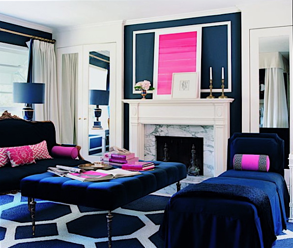
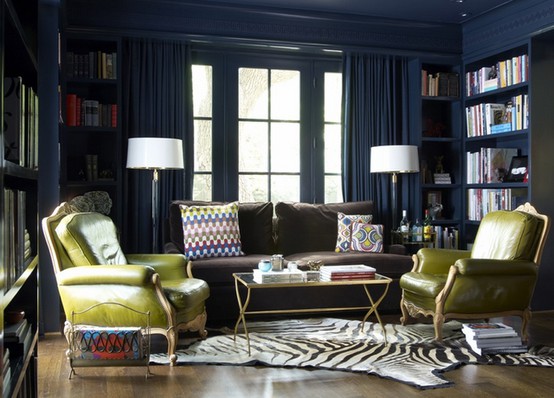
I thought it would be interesting to focus on navy or dark blue. It is a colour I never really enjoyed until now, I think this has a lot to do with the relationship I draw between it and my school uniform. But now that that is long gone... Let's enjoy navy blue.


All images from google or self taken.
http://experiencingarchitecture.com/2011/05/19/colour/