Wednesday, August 15, 2012

ferm Living

Don't forget to go to the facebook page and 'like' the page for regular updates!
https://www.facebook.com/designformfunction

ferm LIVING is a Danish company that aims at designing and manufacturing interior products with a graphic touch. The product range consists of wallpaper, wall stickers, textiles, kitchen items, a large KIDS collection and much more great stuff to come…


"ferm LIVING originates from a graphic design agency in Aarhus, Denmark, founded by Trine Andersen in 2005. The company came to life after Trine, mostly for fun, decided to visit a clairvoyant. (Who would have thought!) Trine was quite astonished when the clairvoyand saw a little bird sitting confused on a branch, not knowing which way to fly. This sight was essential for Trine’s decision to follow her dream of starting her own business. When she then founded ferm, the little bird found knew exactly where to go and now sits on top of the company logo.

The company went from being a graphic design agency to a company designs and selling lifestyle products when Trine was re-decoration her house. She was looking for graphic wallpaper, but just couldn’t find the right pattern – and when she found it, it was way too expensive. Trine decided, that other people probably felt the same way, so she decided to take it upon herself to create graphic wallpaper patterns at an affordable price. By February 2006, the very first wallpaper collection hit the streets, and since then things have been going fast! ferm LIVING now operates in many markets around the world and has agents/distributors in Australia, USA, Finland, The Netherlands, UK, Spain, France, Italy, Sweden and Japan."


What a wonderful tale, special things can happen when you simply stop and listen...

ferm LIVING are always thinking of new ideas, designs and are always on the hunt for new sources of inspiration. Their blog is a great way of understanding how their design brains work and why the company is so special. 


Say hello to Mr. & Mrs. Poster. Our two new illustrations are now in stock. 


"We proudly present our Autumn Winter 2012 Collection"

Click here to read the entire catalogue. 

Here are my favourite images from their Autumn Winter 2012 Collection. It's a shame that they are European and their seasons are opposite to ours. On second thought, perhaps it's exciting to purchase something online and wait for the excitement of being able to use it when the cooler months come around!






Tuesday, August 14, 2012

Colour + Architecture

Yesterday was a day of firsts for many reasons. I found out how many people are reading my blog on a daily basis... WOW! Thank you!

This post suggestion was inspired by Ruby who is an architecture student, who left a really meaningful comment for me yesterday. These little comments really make a huge difference, so thank you!

I have now created a Facebook page to make navigating the blog and keeping up to date with posts a lot more user friendly. Please go to the Facebook page and like it so we can keep in touch!


Architecture can move us, it elicits different emotions, it can bring back memories and elicit direct emotions, like letting you feel small or big, or providing a safe feeling or even an unsafe one. When creating a space, whether it be in regards to styling, decorating, building, or designing we all try to elicit enjoyable emotions. Architectural spaces have certain atmospheres that influence the emotional state of a person: the interaction between the environment and its occupant.

Colour is a very powerful mean in architecture. How we experience colour depends on the colours surrounding us in our daily life. Warm and cold colours play an important role in our lives and evoke very different moods and emotions. We experience them in the variations of daylight from morning to evening and even into the darkness of night. 

The eye adjusts itself to the gradual change so that the local colours of details appear the same throughout the day. But if we observe something as a whole, a street scene or a lounge room for example, we become aware of the changes in the colour scheme. The mood of the scene and often even our mood changes with the changing light.

Here is an image I took this morning. Initially I was frustrated that the light was battling through the trees and casting shadows onto the Victorian Cottage and then I thought a little more about it and realised just what an effect it was making. 


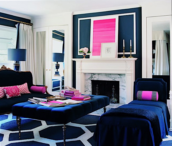
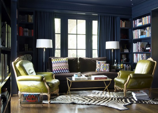
I thought it would be interesting to focus on navy or dark blue. It is a colour I never really enjoyed until now, I think this has a lot to do with the relationship I draw between it and my school uniform. But now that that is long gone... Let's enjoy navy blue.


All images from google or self taken.
http://experiencingarchitecture.com/2011/05/19/colour/ 

Monday, August 13, 2012

White Forest Home - WFH


An overview of the beloved White Forest Home.
WFH is a boutique homewares company that designs limited edition prints. Each wall print focuses on the beautiful qualities of colour, design principles, painted textures and typography - all my great loves.

The team at WFH began the journey with the intention of capturing the current industry trends that inspire us all. Their design intention was to bring smiles and light to our day, at an affordable price.

The team at WFH has a special place in their hearts for colour, "colour is our world and we can't wait to share our colourful vision".

One may ask how a company is always up to date with the latest trends, colour and themes. Each week they review the latest and greatest trends to capture a collection of prints that work for their current palettes whilst providing a timeless appeal. 

We are all to blame of falling in love with an artwork or even a pair of shoes one week and questioning the purchase the following season. This is the reason WFH prides themselves on providing timeless appeal through colour, trends and prints.

WFH is designed and printed in Melbourne. They print on a soft and subtle marked textured fabric, which is acid free and therefore lasts a lifetime and will not fade.

What is new on their blog?

The latest news from WFH is their most recent feature in Home Beautiful Magazine, September 12 Issue. "It is a feature about the geometric/Aztec theme which is so hot right now". Their Geo Tri prints (pictured below) have been very successful for WFH. "The colours are different and lovely and show a unique take on this trend." They describe the prints as "simplified shapes and repetitions" - with a POW of colour.


Thursday, August 9, 2012

and company and me


As I move further towards establishing myself in the creative industry I am encountering topics of all kinds which have previously been words, thoughts or actions I have bypassed. 

For me, the course was unintentionally summed up before it even began by Annalise (the founder of &company), "knowledge is power". The course and the topics that will be discussed over the four weeks are vital to any company, but as a designer they are often things you do not wish to occupy your time with. We just want to use our hands and be creative, instead of being caught between pen and paper. 

&company is a design studio made up of emerging designers and their products. They focus their efforts on giving designers a jump start as they develop into capable and confident professionals.

A new initiative by &company falls under their workshop header. The workshop entitled, Designing your day job, recognises the contemporary importance of being a mini entrepreneur for one's self as well as a designer. 

Over four weeks the course covers Intellectual Property with David Hughes from Griffith Hack, the retail sector with Terri Winter of Top3 by Design, tax and bookkeeping with Catherine McMurtie and finally the legal sector with Chris Chow. 

Last night began the first of the four sessions with David Hughes. The session was a small group of 6 eager creative types accompanied by the lovely Annalise of &company. 
We listened and together discussed; the basic concepts relating to intellectual property (IP) (the who, what, when and how), the components of IP, their strengths limitations and uses and discussed in depth the purpose of trademarks, business names, copyright, registered designs and patents. 

David Hughes described intellectually property as "the intangibles". They are those things you are not able to touch, hold or feel, but they are the real value sources. 

I cannot wait to hear Terri Winter next week!

A sneaky picture from last night's session...

That's a little of chatter for a blog that enjoys images so here are some images of &company's work.


Wednesday, August 8, 2012

My very own fabrics!

I have been designing fabrics since 2009, my second year at university and have used a process to transfer prints onto fabric by hand. Although this process does provide you with your print on a material it is very time consuming and not always never perfect. I began searching in Sydney for a company that was willing to print my designs on small rolls of fabric, without the large price tag - of course, no where was willing to do so.
Finally, I stumbled across a company in the US who is able to print onto almost any type of fabric for a very reasonable price, at any fabric amount!
Four weeks after placing my order, no only are my fabrics are now sitting in my hot little hands, they are also listed on the web for sale and can be made into any product possible. Let's think lamp shades, cushions, chair covers, bed spreads, curtains, book covers... the possibilities are literally endless.

 Below are images of the test swatches I had printed of 6 very basic prints.
I focused my attention towards basic designs as I was apprehensive about the printing process. However, now that I can see how fantastic the results are I cannot wait to display some of my more complex and interesting designs.

Please spread the word about the prints, show the pictures to anyone that may be interested in designs of any sorts. Feedback and requests are always welcome! Don't hesitate to send me an email at ellenjoannepollak@gmail.com

Watch this space for more exciting moments from Design, Form, Function in the coming days and a new Facebook group to make posting my blogs and inspirational images easier!

Big steps, it's time to start believing!


Tuesday, August 7, 2012

Colour combinations for your special day!

Wondering how to pick your wedding day colours and make them work? Here’s a guide to creating a winning palette.
by The Knot 
 
10 Fabulous Colour Combos- Yellow & Duck Egg BlueThe hottest thing happening at wedding receptions isn’t just on the dance floor — it’s on the wedding cake, the invitations, the centrepieces, and even the bride’s gown. It’s big, bold colour. Years ago brides used colour to accent their white wedding day decor, but now they’re using colour to cover every inch of the wedding. We’ve developed a step-by-step guide on colour coordination (from choosing it to decorating with it) to help you dream up a bright wedding day.

Choosing Your Colour

First things first: location. When deciding on a scheme, you must consider the reception space or choose a space without decor or colour. If you’ve chosen a country club with navy and maroon Oriental carpets, a colour scheme of lime green and hot pink won’t work.
Next, become aware of colour combinations that you like, whether browsing art galleries or flipping through a stack of fashion magazines. You might be able to narrow down your colour choices to a half a dozen. To help you choose the exact hue for your wedding details, visit a local fabric store or paint shop and collect swatches or chips of colours you might want to use. This will help you get specific, so that when you decide on green you’ll know if it’s lime green, kelly green, sage green, or forest green. If you have access to a Pantone book, use this collection of colours to select your shade the same way graphic designers do. Many invitation designers mix ink to match the colours in this book, and many cake bakers use Pantone numbers as a reference when creating dye for frosting. Can’t decide on just one or two colours... choose three!

See below for some great colour combinations!


10 Fabulous Colour Combos- Fuschia & Navy

10 Fabulous Colour Combos- Green & Brown

10 Fabulous Colour Combos- Pink & Aqua

http://theknot.ninemsn.com.au/wedding-planning/wedding-colours/picking-your-wedding-colours

How about a little yellow...

Stylish Yellow Wedding Details- Yellow Table Number Stylish Yellow Wedding Details- Bird Themed Table Setting Stylish Yellow Wedding Details- Chair Pom Poms Stylish Yellow Wedding Details- Mr. & Mrs. Table Sign Stylish Yellow Wedding Details- Menu Card With Twine Stylish Yellow Wedding Details- Initial Wreath  Stylish Yellow Wedding Details- Mis-Matched Centrepieces Stylish Yellow Wedding Details- Candle Votives 
http://theknot.ninemsn.com.au/wedding-planning/wedding-colours/yellow/stylish-yellow-wedding-details?photo_index=10

Wednesday, August 1, 2012

Designer Rugs- Akira Isogawa

Designer Rugs often work with creatives from within the industry. They have recently supported Akira Isogawa's third collection for Designer Rugs. The showing of the new range was on Tuesday night at Simmer on e Bay in Sydney. Akira's clothing designs are creative to say the least, refreshing, unique and a combination of colour and textures.

While studying at university we had an assignment to design a series or collection of rugs for the Designer Rugs competition. I thoroughly enjoyed the assignment as it introduced me into the process of rug making and designing and provided us wit the opportunity to work with creatives from the professional industry and receive a design brief directly from the industry. 


Rug Design

This rug design was created for the RugUp competition and was one of 6 designs. My designs were short-listed for the competition. I designed the rugs for the NSW State Library by taking architectural elements of the building and translating them into designs, such as marble stairways and sandstone pillars.